• About BoJoda Design
  • Portfolio
    • Recent Work
    • iPad
      • AARP Media
      • The Wonderfactory — AARP
      • Time Inc. — People
      • Hearst Magazines — Popular Mechanics
      • Rodale Inc. — Men’s Health
    • iPhone
    • Editorial Design
      • Men’s Health Magazine
      • OK! Magazine
      • New Jersey Monthly Magazine
    • Book Cover Design
    • Logos/Branding
    • Invitations, etc.
    • Philatelic Design
  • App Reviews
  • Travel Writing
  • Photography
  • Contact

BoJoda Design

~ Visual + Digital Design, Etceteras

BoJoda Design

Category Archives: Graphic Design

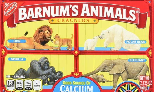
Animal Crackers Set Free!

22 Wednesday Aug 2018

Posted by bojodadesign in Graphic Design, Packaging

≈ Leave a comment

Tags

Barnum's Animals Crackers, Cookies, Mondelez International, Nabisco, PETA

animal-crackers1_custom-NPPR

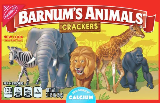
In the new Barnum’s Animals box, the animals roam free. (Mondelez International)

After more than a century behind bars, the beasts on boxes of Barnum’s Animals crackers have been freed from their cages. Facing pressure from People for the Ethical Treatment of Animals (PETA), Mondelez International, the parent company of Nabisco, has redesigned the famous packaging. (READ MORE)

Animal Crackers Caged source Amazon

The old box showed the animals in cages. (Source: Amazon)


Come Fly With Me

03 Wednesday Aug 2016

Posted by bojodadesign in Advertising, Graphic Design, Posters, Travel

≈ Leave a comment

Tags

Airline Visual Identity, Callisto Publishing

Courtesy Callisto Publishers GmbH

Courtesy Callisto Publishers GmbH


A new large-format art book, Airline Visual Identity 1945 – 1975, out now from Callisto Publishing, chronicles the so-called “Golden Age of Travel,” with gorgeous, full-page advertisements from giants in the sky like TWA, Air France, and yes, even the real American Airlines.

These vintage posters, many of which illustrate the awe and optimism that shaped the design of the Jet Age, showcase an era when flying was one of the most glamorous things you could do, when passengers dressed to impress and legroom, well, actually existed. (READ MORE)

Excerpted from Travel+Leisure

MADMEN0415-air-france

Courtesy Callisto Publishers GmbH

MADMEN0415-american

Courtesy Callisto Publishers GmbH


The Met’s New Logo

19 Friday Feb 2016

Posted by bojodadesign in Graphic Design, Logos, Museums

≈ Leave a comment

Tags

Met, Met's new logo, Metropolitan Museum of Art

The Met's new logo, designed by the London-based global-branding firm Wolff Olins

The Met’s new logo, designed by the London-based global-branding firm Wolff Olins

The Metropolitan Museum of Art has a new logo. The Met is now THE MET, the two short words printed in scarlet letters, stacked and squashed together. The Met will also get a new map and fresh signage. In a statement, the museum said that the logo is part of a new graphic language, all rolling out March 1, that’s intended to make the Met “feel more available and accessible to first-time as well as frequent visitors.” (READ MORE)

17-old-met-logo.w529.h352

The Met’s old logo

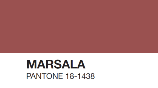
2015 Color of the Year: Marsala

20 Friday Feb 2015

Posted by bojodadesign in Branding, Design, Fashion, Graphic Design, Trends

≈ Leave a comment

Tags

Color of the Year, Marsala, Pantone

Pantone has declared Marsala, a naturally robust and earthy wine red, as the 2015 color of the year. Marsala, say the color experts, is rich, grounded, steady and satisfying, ideal for print, P.O.P. and packaging. (MORE)

body_5_3

6126886_G

“Marsala is a subtly seductive shade, one that draws us in to its embracing warmth.” — Leatrice Eiseman Executive Director, Pantone Color Institute®

The Evolving Sonos Identity

19 Thursday Feb 2015

Posted by bojodadesign in Branding, Graphic Design, Logos

≈ Leave a comment

Tags

Bruce Mau Design, Sonos

aqbe2rg2emwmxpprbvbsuw1dopu0h070vlgyda9boazsh20785

In 2011, consumer electronics company Sonos, known for their smart system of HiFi wireless speakers and audio components, retained Bruce Mau Design (BMD) to help re-think their brand identity.

Now, in 2015, Sonos continues to grow exponentially and numerous competitors have entered the market as wireless audio becomes more commonplace. Last year, BMD and Sonos pushed harder to signal Sonos’ leadership, relevance, and dedication to the music experience.

This new iteration of the Sonos visual identity advances the idea of the modern music experience into a rich diversity of expressions. The new identity launched internally with a BMD-designed brand video and is now making its way to the public.

An unintended benefit of BMD’s new logo design for Sonos is a visual effect evoking a sound vibration that appears on screens when the graphic is scrolled. Laura Stein, creative director on the Sonos rebranding, told Fast Company that there wasn’t a whole lot of science behind it, and it was a kind of “happy accident” that the logo vibrates and that this complements the original intention. (MORE)

BMD's Sonos logo has an unexpected result — scroll up or down on this page and you'll see.

BMD’s new logo design for Sonos came with an unplanned benefit — an optical illusion evoking a sound vibration that appears on screens when the graphic is scrolled. Try it!
Behind the Logo

01 Tuesday Apr 2014

Posted by bojodadesign in Graphic Design, Logos

≈ 1 Comment

Tags

Amazon.com, Baskin Robbins, FedEx, Goodwill Industries, Hershey's Kisses, Le Tour de France, Milwaukee Brewers, Northwest Airlines, Pittsburgh Zoo & PPG Aquarium, Toblerone

How observant are you? You’ll never look at these logos the same way again!

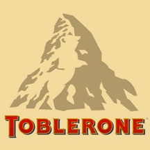
There is a dancing bear above the "BLE". Toblerone chocolate bars originated in Berne , Switzerland , whose symbol is the bear. It features the animal on its flag and coat-of-arms.

Toblerone: There is a dancing bear above the “BLE”. Toblerone chocolate bars originated in Berne, Switzerland, whose symbol is the bear. It features the animal on its flag and coat-of-arms.


Do you see the arrow between the "E" and "x" (in white)?

FedEx: Do you see the arrow between the “E” and “x” (in white)?


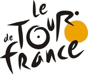
The world's most famous bike race. The "R" in "Tour" is a cyclist. The yellow circle is the front wheel of a bicycle, the "O" is the back wheel.

Le Tour de France: The world’s most famous bike race. The “R” in “Tour” is a cyclist. The yellow circle is the front wheel of a bicycle, the “O” is the back wheel.


Northwest Airlines. The circle is a compass. The arrow in the upper left corner is pointing..? North West of course!

Northwest Airlines. The circle is a compass. The arrow in the upper left corner is pointing..? North West of course!


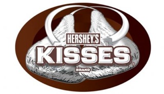
Hershey's Kisses: The gap between the "K" and the "I" is a sideways chocolate kiss.

Hershey’s Kisses: The gap between the “K” and the “I” is a sideways chocolate kiss.


Tostitos: The 2nd and 3rd "T's" are two people sharing (or fighting over) a  tortilla and a bowl of salsa.

Tostitos: The 2nd and 3rd “T’s” are two people sharing (or fighting over) a tortilla and a bowl of salsa.


Amazon.com: The arrow means Amazon has everything from A to Z.

Amazon.com: The arrow means Amazon has everything from A to Z.


Baskin Robbins: See the " 31" embedded in the " BR"? Thirty one-derful flavors!

Baskin Robbins: See the ” 31″ embedded in the ” BR”? Thirty one-derful flavors!


Goodwill Industries: The smiley half face is also a 'g".

Goodwill Industries: The smiley half face is also a “g”.


Milwaukee Brewers: The emblem for the Milwaukee Brewers.  Baseball glove forms an "M" and a "B". This Logo was designed by a college student.

Milwaukee Brewers: The emblem for the Milwaukee Brewers. The baseball glove forms an “M” and a “B”. This logo was designed by a college student.


Pittsburgh Zoo & PPG Aquarium: See the gorilla and lioness (in white) facing each other?

Pittsburgh Zoo & PPG Aquarium: See the gorilla and lioness (in white) facing each other?

Logo-licious

01 Monday Jul 2013

Posted by bojodadesign in Graphic Design, Logos, Trends

≈ Leave a comment

Tags

Bill Gardner, GDUSA, Logo Trend Report, Logos

wave-4

WAVE: Victor Goloubinov, Cursir

monograms-4

MONOGRAMS: Moter, Molly’s Marauders

membrane-1

MEMBRANE: Tallgrass Studios, Sunstone

written-4

WRITTEN: Simon Frouws Design, Hoopenburg Wines

With ever-evolving technology and social media, brand designers are finding it challenging to keep up. “Designers are experimenting and making smart decisions for smart clients,” says GDUSA‘s Bill Gardner. For it’s recently published 2013 Logo Trend Report, GDUSA examined more than 20,000 logos. Fifteen trends in logo design were observed, such as wave, written, monograms, and membrane, pictured here. (MORE)

Moving Type

14 Tuesday May 2013

Posted by bojodadesign in Animated Video, Graphic Design, History, Typography

≈ 4 Comments

Tags

Ben Barrett-Forrest, paper letters, The History of Typography, typography, video animation, whitehorse yukon

291 Paper Letters. 2,454 Photographs. 140 hours of work. A paper-letter video animation about the history of fonts and typography, created by Ben Barrett-Forrest, a designer and animator from Whitehorse, Yukon. © Forrest Media, 2013

Eco Art: 100 Posters for Change

09 Saturday Mar 2013

Posted by bojodadesign in Art, Conservation, Environment, Global Issues, Graphic Design, Illustration, Media, Posters, Water

≈ 2 Comments

Tags

Alice Druedling, Ecology, Environment, Joe Scorsone, Posters, Riverside Art Museum, Water

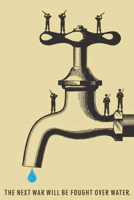
Eco Art: Graphic Design for Change

Poster: Joe Scorsone + Alice Drueding

The above poster and 99 others are all part of The 4th Block’s Eco-Poster Competition, currently featured in an exhibition at the Riverside Art Museum in Riverside, California. The posters on display use design as a tool for addressing issues of transportation, air, and water pollution — challenges directly affecting the lives of residents every single day in Southern California. The exhibition has been extended through March 30. (MORE)

Rolling Stones Logo: Movin’ Like Jagger

18 Wednesday Jul 2012

Posted by bojodadesign in Graphic Design, Logos, Music, Typography

≈ Leave a comment

Tags

John Pasche, Keith Richards, Mick Jagger, Rolling Stones, Shepard Fairey

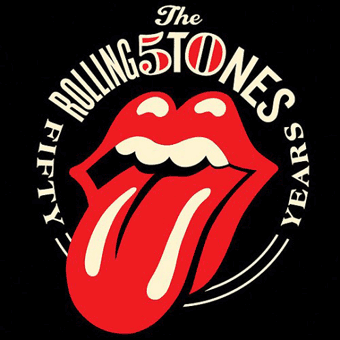
The Rolling Stones revealed their updated logo on their web site in late June and have announced a 50th anniversary concert tour for next year. The legendary rock band’s new logo was designed by Shepard Fairey, and features the signature tongue-and-lips symbol, which was originally developed by designer John Pasche for the band’s 1971 album “Sticky Fingers”.

← Older posts

Subscribe

  • Entries (RSS)
  • Comments (RSS)

Archives

  • May 2020
  • August 2018
  • July 2018
  • June 2018
  • August 2017
  • December 2016
  • November 2016
  • August 2016
  • April 2016
  • February 2016
  • January 2016
  • September 2015
  • August 2015
  • May 2015
  • April 2015
  • February 2015
  • October 2014
  • September 2014
  • August 2014
  • July 2014
  • May 2014
  • April 2014
  • March 2014
  • February 2014
  • December 2013
  • September 2013
  • August 2013
  • July 2013
  • June 2013
  • May 2013
  • March 2013
  • January 2013
  • December 2012
  • November 2012
  • September 2012
  • July 2012
  • June 2012
  • April 2012
  • March 2012
  • December 2011
  • November 2011
  • October 2011
  • September 2011
  • August 2011

Categories

  • 9/11
  • Advertising
  • Americana
  • Architecture
  • Art
  • Asparagus
  • Autumn
  • Books
  • Branding
  • Cake
  • Cats
  • Celebrities
  • Christmas
  • Comedy
  • Conservation
  • Corn
  • Design
  • Environment
  • Fall
  • Fashion
  • Film
  • Fine Art
  • Folk Art
  • Food
  • Gardens
  • Global Issues
  • Graphic Design
  • Gratitude
  • Halloween
  • History
  • Holiday
  • Hunting
  • Illustration
  • Infographics
  • Jack-'O-Lantern
  • Logos
  • Magazines
  • Manhattan
  • Maritime
  • Media
  • Movies
  • Museums
  • Music
  • National Parks
  • Nature
  • New York City
  • News
  • Newspapers
  • Nostalgia
  • Obituaries
  • Olympics
  • Packaging
  • Painting
  • Philately
  • Photography
  • Politics
  • Portraits
  • Postcards
  • Posters
  • Potatoes
  • Publishing
  • Pumpkins
  • Quizzes
  • Quotes
  • Recipes
  • Sports
    • Tennis
  • Stamps
  • Summer
  • Television
  • Thanksgiving
  • Travel
  • Trends
  • Typography
  • United Nations
  • Video
    • Animated Video
    • Commercials
    • GoPro Video
    • Music
    • Video Games
  • Water
  • Web Sites
  • World Trade Center

Meta

  • Register
  • Log in

Blog at WordPress.com.

  • Follow Following
    • BoJoda Design
    • Join 55 other followers
    • Already have a WordPress.com account? Log in now.
    • BoJoda Design
    • Customize
    • Follow Following
    • Sign up
    • Log in
    • Report this content
    • View site in Reader
    • Manage subscriptions
    • Collapse this bar
 

Loading Comments...