— AARP Magazine for iPad, April-May 2015
Robin Roberts: Life at 50+
22 Wednesday Apr 2015

22 Wednesday Apr 2015
— AARP Magazine for iPad, April-May 2015
20 Friday Feb 2015
Posted in Branding, Design, Fashion, Graphic Design, Trends
Tags
Pantone has declared Marsala, a naturally robust and earthy wine red, as the 2015 color of the year. Marsala, say the color experts, is rich, grounded, steady and satisfying, ideal for print, P.O.P. and packaging. (MORE)
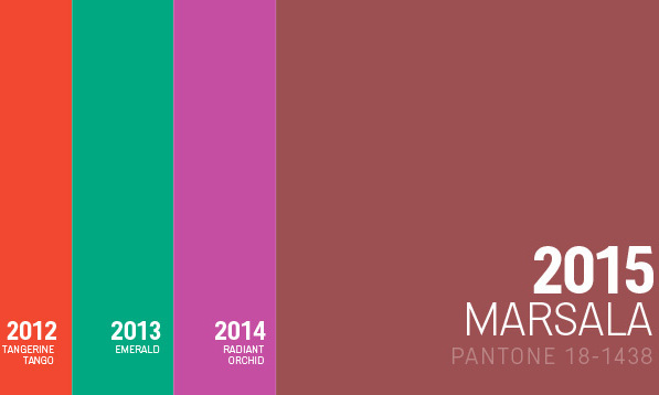

“Marsala is a subtly seductive shade, one that draws us in to its embracing warmth.” — Leatrice Eiseman Executive Director, Pantone Color Institute®
19 Thursday Feb 2015
Posted in Branding, Graphic Design, Logos
Tags

In 2011, consumer electronics company Sonos, known for their smart system of HiFi wireless speakers and audio components, retained Bruce Mau Design (BMD) to help re-think their brand identity.
Now, in 2015, Sonos continues to grow exponentially and numerous competitors have entered the market as wireless audio becomes more commonplace. Last year, BMD and Sonos pushed harder to signal Sonos’ leadership, relevance, and dedication to the music experience.
This new iteration of the Sonos visual identity advances the idea of the modern music experience into a rich diversity of expressions. The new identity launched internally with a BMD-designed brand video and is now making its way to the public.
An unintended benefit of BMD’s new logo design for Sonos is a visual effect evoking a sound vibration that appears on screens when the graphic is scrolled. Laura Stein, creative director on the Sonos rebranding, told Fast Company that there wasn’t a whole lot of science behind it, and it was a kind of “happy accident” that the logo vibrates and that this complements the original intention. (MORE)

BMD’s new logo design for Sonos came with an unplanned benefit — an optical illusion evoking a sound vibration that appears on screens when the graphic is scrolled. Try it!
20 Tuesday Aug 2013
Posted in Branding, Logos, Media, Television
Tags

ABC Television Network is rolling out a new on-air identity. Branding agency Loyalkaspar has refreshed the logo, which was originally created in the early 1960s by the late Paul Rand. Over the years, the logo became more spherical, and glares and reflections were added to the surface. The new design is flatter, the gradients are toned down, and subtly changes color based on time of day and type of program. The logo, says Loyalkaspar, is rebuilt to Rand’s original blueprint and proportions, and it has been stripped of everything superfluous in the hopes of creating something “articulate, luxurious, cinematic.” The identity program has been two years in the making and includes the use of a dedicated typeface called “ABC Modern.” (MORE)
