Tags
architecture, Arts-and-Crafts movement, Charles Rennie Mackintosh, Dean Marchetto, Jenniann Barile, The Gate
A logo doesn’t sell, it identifies. A logo derives its meaning from the quality of the thing it symbolizes, not the other way around. A logo is less important than the product it signifies; what it means is more important than what it looks like.
— Paul Rand

Logo for The Gate, luxury condominium residence, Hoboken, New Jersey: BoJoda Design. Typeface: ITC Rennie Mackintosh.
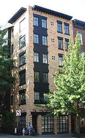
I designed this logo for Jenniann Barile, developer of The Gate, a 10-unit Arts-and-Crafts influenced luxury condominium apartment complex in Hoboken, New Jersey. Charles Rennie Mackintosh was a Scottish architect, designer, watercolorist and sculptor. The font is ITC Rennie Mackintosh, which was inspired and developed from Mackintosh’s impeccably hand-lettered architectural renderings, posters, book jackets, etc. Ms. Barile traveled to Glasgow, Scotland with principal architect Dean Marchetto, where they studied Mackintosh’s work. Marchetto reinterpreted Hoboken’s traditional forms by incorporating elements from the great Arts-and-Craft’s architect’s designs. The Gate’s brick facade and vertically punched windows are a nod to Hoboken conventions; its black lintels and modern rooftop cornice pay homage to Mackintosh. The building has won several awards, including the Residential Architect Design Award. The building, as one judge said, “understands history rather than mimicking it.”


I’ve always loved that logo and passed by it every day when I lived in Hoboken. It’s great to hear about your inspiration and your process.